Parent Element (Container)
The flex container becomes flexible by setting the display property to flex:
1 | .flex-container { |
The flex container properties are:
- flex-direction
- row
- row-reverse
- column
- column-reverse
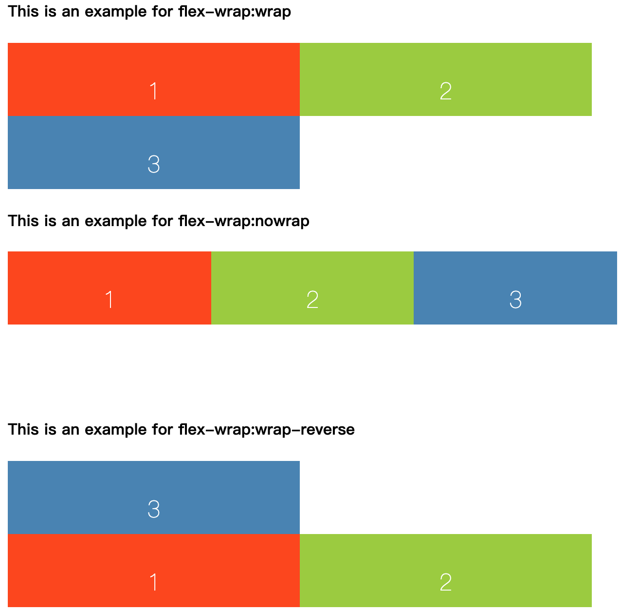
- flex-wrap
- nowrap
- wrap
- wrap-reverse
- flex-flow
The flex-flow property is a shorthand property for: flex-direction, flex-wrap
- order
The order CSS property sets the order to lay out an item in a flex or grid container. Items in a container are sorted by ascending order value and then by their source code order.
- justify-content
- align-items
- align-content