Definition and Usage
Metadata is data (information) about data.
The <meta> tag provides metadata about the HTML document. Metadata will not be displayed on the page, but will be machine parsable.
Meta elements are typically used to specify page description, keywords, author of the document, last modified, and other metadata.
The metadata can be used by browsers (how to display content or reload page), search engines (keywords), or other web services.
HTML5 introduced a method to let web designers take control over the viewport (the user’s visible area of a web page), through the <meta> tag (See “Setting The Viewport” example below).
Tips and Notes
Note: <meta> tags always go inside the <head> element.
Note: Metadata is always passed as name/value pairs.
Note: The content attribute MUST be defined if the name or the http-equiv attribute is defined. If none of these are defined, the content attribute CANNOT be defined.
Differences Between HTML 4.01 and HTML5
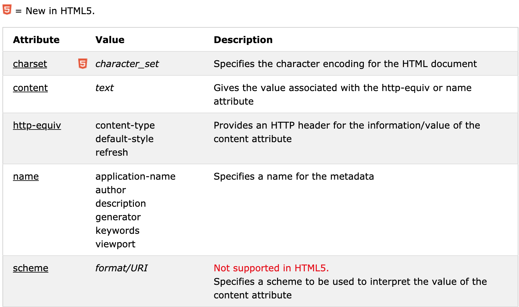
The scheme attribute is not supported in HTML5.
HTML5 has a new attribute, charset, which makes it easier to define charset:
- HTML 4.01:
<meta http-equiv="content-type" content="text/html; charset=UTF-8"> - HTML5:
<meta charset="UTF-8">
Examples
Example 1 - Define keywords for search engines:
1 | <meta name="keywords" content="HTML, CSS, XML, XHTML, JavaScript"> |
Example 2 - Define a description of your web page:
1 | <meta name="description" content="Free Web tutorials on HTML and CSS"> |
Example 3 - Define the author of a page:
1 | <meta name="author" content="John Doe"> |
Example 4 - Refresh document every 30 seconds:
1 | <meta http-equiv="refresh" content="30"> |
Example 5 - Setting the viewport to make your website look good on all devices:
1 | <meta name="viewport" content="width=device-width, initial-scale=1.0"> |
Attributes
Viewport
Using the viewport meta tag to control layout on mobile browsers
What is The Viewport?
The viewport is the user’s visible area of a web page.
The viewport varies with the device, and will be smaller on a mobile phone than on a computer screen.
Before tablets and mobile phones, web pages were designed only for computer screens, and it was common for web pages to have a static design and a fixed size.
Then, when we started surfing the internet using tablets and mobile phones, fixed size web pages were too large to fit the viewport. To fix this, browsers on those devices scaled down the entire web page to fit the screen.
Setting The Viewport
HTML5 introduced a method to let web designers take control over the viewport, through the <meta> tag.
You should include the following <meta> viewport element in all your web pages:
1 | <meta name="viewport" content="width=device-width, initial-scale=1.0"> |
A <meta> viewport element gives the browser instructions on how to control the page’s dimensions and scaling.
The width=device-width part sets the width of the page to follow the screen-width of the device (which will vary depending on the device).
The initial-scale=1.0 part sets the initial zoom level when the page is first loaded by the browser.
Size Content to The Viewport
Users are used to scroll websites vertically on both desktop and mobile devices - but not horizontally!
So, if the user is forced to scroll horizontally, or zoom out, to see the whole web page it results in a poor user experience.
Some additional rules to follow:
Do NOT use large fixed width elements - For example, if an image is displayed at a width wider than the viewport it can cause the viewport to scroll horizontally. Remember to adjust this content to fit within the width of the viewport.
Do NOT let the content rely on a particular viewport width to render well - Since screen dimensions and width in CSS pixels vary widely between devices, content should not rely on a particular viewport width to render well.
Use CSS media queries to apply different styling for small and large screens - Setting large absolute CSS widths for page elements will cause the element to be too wide for the viewport on a smaller device. Instead, consider using relative width values, such as width: 100%. Also, be careful of using large absolute positioning values. It may cause the element to fall outside the viewport on small devices.